Sunday, August 5, 2012

Disney Princess Movie Theatre!


Here is another Disney cover I did for the Movie Theater collection. This one is Disney Princess based! You can guess how high my excitement was when I was assigned this cover! :)

So here is my first trail run with the Projection Cover.

Editor's Notes:
-Move Belle into the foreground
-The Projector: Switch the colors of pink and purple.
Body of the Projector turn to Pink and the looking glass and button to Purple.
-Include all 3 girls on the projection sticker.
-Instead of a rectangle and a white stroke around the child change it to a vignette oval with a soft outer glow.
-The sellsheet sticker's (the sticker over the blister) purple stroke is very dark.
-My editor loved the two tone gradient I created for the projector sticker. So I need to incorporate that same gradient style to the sellsheet.


This is the finalized Cover.


My Personal Editing:
-Since we moved Belle in the foreground I decided to move Ariel higher on the page and also Enlarge Cindy (so Belle dips in the center of the page).
-I Enlarged and duplicated the stars on the side bar to pop. I feel this tactic would allow your eyes to move horizontally across the page.
-I chose to use a magenta stroke around the sell sheet and flipped the gradient two tone pink. (The center is darker and the outer circle is lighter). That way the text will not get lost in the design.

Overall this one is on the top of my list for Disney Covers. On Tuesday( August 7th, 2012) Reader's Digest will discuss with Disney's UK branch about the covers in a meeting!

Animal Friends Movie Theater Cover


 Here is another Movie Theatre Cover for the book Disney Animal Friends Movie Theater. This book is about all of Disney's Animal friends. Here kids can read several character stories such as Simba, Nemo, and Balu and follow along with a fun slide show movie projector. This book as a total of 20 slides.

Cover:
This cover was such a challenge to me as a designer because of the mass amount of characters. Some animals came from the land while the others lived in the deep blue sea.

The Goal:
Was to make each character fit together as a single design and unit.
My first design I incorporated an ocean on the top of the page and a jungle scene along the bottom section of the cover.

Editor's Notes:
-The backgrounds were far too busy and we lost sight of the characters.

Final Design:
I created a gradient background of blue to a bright green. But the one issue I had was I felt that the characters were just floating in space. So to break the free form I added a few leaves and blended them into the green. While for the ocean section on the top, I added a few fun bubbles.


Noah's Ark Play and Pop Up Book

So my assignment this week was to help design several spreads and sticker sheets for a new Christian book called Noah's Ark Play and Pop Up Book. Here kids will go through the Biblical story of Noah's Ark with fun interactive stickers and an added plus it is in pop up!


Here are two sticker sheets that will be used for this book.

Sticker Sheet Guidelines:
- 2mm space between the art work and the die line
-3mm space between each sticker
- 2 mm bleed.

This is always very difficult because you are dealing with a lot of size and spacing. It was like playing Tetris. If the measurements are not correct we could lose the client entirely! I decieded to create a small circle that was 7 mm and put them in between the images of the page. This helped me stay ontop of the space and stay clear of the bleed.

Overall this was fun to complete!

Sunday, July 29, 2012

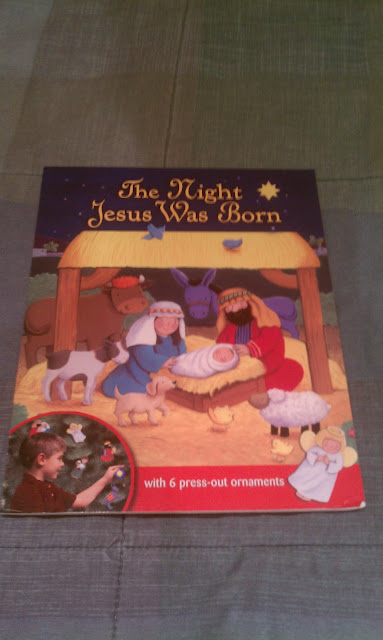
Nativity Covers Finalized.


UK DISNEY PROJECTOR COVERS

I was assigned to design several Disney covers for the UK stores and offices.
COVERS: Mickey Mouse Club House Movie Theater, The Lion King Movie Theater, Marvel's The Mighty Avenger's Movie Theater, Brave Movie Theater.

 The book covers are more vertical in comparison to the United States versions.  On the right side of the covers is a :
Movie projector
A blister packet and sticker, containing 5 movie projector disks.
20 Images for each book!

So when the child reads the story he can see certain movie scenes come to life on his/her wall.


Here is the Brave Movie Theater. The top image was my first design.
This design shows more of the archery range and castle in the distance.

The New Brave Cover is I moved the Archery range and centered the castle and the title.

Fisher Price Box Display

I was assigned to design a box display for Fisher Price. Box displays tend to be bought in bulk for shelves by clients like : Costco, Sam's Club, TJMaxx, Target and other stores. The image below is my first draft.

The display was originally meant for the Easter Holiday. 

Editor Notes#1:
Move the Zoo books down on the lower level
Move the Noah's Arks books in the lower left hand corner
Shrink the White circle Logo
Remove the $8.99 price


Version #2:
My Editor's and the Reader's Digest marketing team decided to divided my box set in half, and instead of a holiday theme we went with the generic.

Here is the final result. This project was very fun and interesting because I had to look at the different perspectives and had to think of how it would look like on a shelf.

Friday, July 20, 2012

Marvel Avenger's Movie Flip Book


 I was assigned to design a lot of the content for the Marvel Avenger's Movie Flipbook. This book is based off the movie.

Assignment:
Design 1 inside cover
Design the dicuts for the flip book
Design 2 spreads of story
2 Flipbooks: 144 pages of screen grabs from the film.


 This is a mock up dummy of the flip book I made. This book is a total of 72 pages. In this scene there is a group of cars exploding in the street. This entire clip is 4 seconds long.


(Right) I designed an inside cover for the Marvel Avenger's Flip Book. There will be 3 individual character stories (Ironman,Hulk,and Thor) inside of the book. 
This was my first spread design. Each page only had a single sentence of text so instead of creating a text box or doing text wrap around the image I created a rectangular shape with a cut edge. I did this because I wanted to make my design cohesive. 

Editor's reviews #1:
-Change the red to a brighter shade.
-Turn the font to double Black
-On page 4 move the red bar to the right side of the page vertically. 


Editor's Review #2:
-Change the red to a bright gold/yellow. 

This is the finished look for my Ironman Spread.


 (left side) The left side is the inside page of the book. Here I deiced to go with the Avenger's logo. (Right side) is my spread. The white space will be a dicut.